Python Tkinter
Table of content
Introduction
Without Tk Python would be less attractive to many users.
Tk is called Tkinter in Python, or to be precise, Tkinter is the Python interface for Tk.
Tkinter is an acronym for "Tk interface".
Tk was developed as a GUI extension for the Tcl scripting language by John Ousterhout.
The first release was in 1991. Tk proved as extremely successful in the 1990's, because it is easier
to learn and to use than other toolkits. So it is no wonder that many programmers wanted to use Tk
independently of Tcl. That's why bindings for lots of other programming languages have been developed,
including Perl, Ada (called TASH), Python (called Tkinter), Ruby, and Common Lisp.
Tk provides the following widgets:
- button
- canvas
- checkbutton
- combobox
- entry
- frame
- label
- labelframe
- listbox
- menu
- menubutton
- message
- notebook
- tk_optionMenu
- panedwindow
- progressbar
- radiobutton
- scale
- scrollbar
- separator
- sizegrip
- spinbox
- text
- treeview
It provides the following top-level windows:
- tk_chooseColor - pops up a dialog box for the user to select a color.
- tk_chooseDirectory - pops up a dialog box for the user to select a directory.
- tk_dialog - creates a modal dialog and waits for a response.
- tk_getOpenFile - pops up a dialog box for the user to select a file to open.
- tk_getSaveFile - pops up a dialog box for the user to select a file to save.
- tk_messageBox - pops up a message window and waits for a user response.
- tk_popup - posts a popup menu.
- toplevel - creates and manipulates toplevel widgets.
Tk also provides three geometry managers:
- place - which positions widgets at absolute locations
- grid - which arranges widgets in a grid
- pack - which packs widgets into a cavity
Hello Tkinter Label
We will start our tutorial with one of the easiest widgets of Tk (Tkinter), i.e. a label.
A Label is a Tkinter Widget class, which is used to display text or an image. The label is a widget
that the user just views but not interact with.
There is hardly any book or introduction into a programming language, which doesn't start with
the "Hello World" example. We will draw on tradition but will slightly modify the output to "Hello Tkinter"
instead of "Hello World".
The following Python script uses Tkinter to create a window with the text "Hello Tkinter". You can use the
Python interpretor to type this script line after line, or you can save it in a file, for example "hello.py":
from Tkinter import *
# if you are working under Python 3, comment the previous line and comment out the following line
#from tkinter import *

root = Tk()

w = Label(root, text="Hello Tkinter!")
w.pack()

root.mainloop()
Starting our example
If we save the script under the name hello.py, we can start it like this:
$ python hello.py
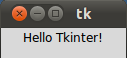
If you run the command under the Gnome and Linux, the window the window will look like this:
Under Windows it appears in the Windows look and feel:

Explanation
The Tkinter module, containing the Tk toolkit, has always to be imported.
In our example, we import everything from Tkinter by using the asterisk symbol ("*") into our module's namespace:
from Tkinter import *
To initialize Tkinter, we have to create a Tk root widget, which is a window with a title bar and
other decoration provided by the window manager. The root widget has to be created before any other widgets
and there can only be one root widget.
root = Tk()
The next line of code contains the Label widget. The first parameter of the Label call is the
name of the parent window, in our case "root". So our Label widget is a child of the root widget.
The keyword parameter "text" specifies the text to be shown:
w = Label(root, text="Hello Tkinter!")
The pack method tells Tk to fit the size of the window to the given
text.
w.pack()
The window won't appear until we enter the Tkinter event loop:
root.mainloop()
Our script will remain in the event loop until we close the window.
Using Images in Labels
As we have already mentioned, labels can contain text and images. The following example contains
two labels, one with a text and the other one with an image.
from Tkinter import *
root = Tk()
logo = PhotoImage(file="../images/python_logo_small.gif")
w1 = Label(root, image=logo).pack(side="right")
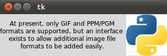
explanation = """At present, only GIF and PPM/PGM
formats are supported, but an interface
exists to allow additional image file
formats to be added easily."""
w2 = Label(root,
justify=LEFT,
padx = 10,
text=explanation).pack(side="left")
root.mainloop()
If you start this script, it will look like this using Ubuntu Linux with Gnome desktop:

The "justify" parameter can be used to justify a text on the LEFT, RIGHT or CENTER.
padx can be used to add additional horizontal padding around a text label.
The default padding is 1 pixel. pady is similar for vertical padding.
The previous example without justify (default is centre) and padx looks like this:
You want the text drawn on top of the image? No problem! We need just one label and use the image and the text
option at the same time. By default, if an image is given, it is drawn instead of the text. To get the
text as well, you have to use the compound option. If you set the compound option to CENTER
the text will be drawn on top of the image:
from Tkinter import *

root = Tk()
logo = PhotoImage(file="../images/python_logo_small.gif")
explanation = """At present, only GIF and PPM/PGM
formats are supported, but an interface
exists to allow additional image file
formats to be added easily."""
w = Label(root,
          compound = CENTER,
          text=explanation,
          image=logo).pack(side="right")

root.mainloop()

We can have the image on the right side and the text left justified with a padding of 10 pixel
on the left and right side by changing the Label command like this:
w = Label(root,
          justify=LEFT,
          compound = LEFT,
          padx = 10,
          text=explanation,
          image=logo).pack(side="right")
If the compound option is set to BOTTOM, LEFT, RIGHT, or TOP, the image is drawn
correspondingly to the bottom, left, right or top of the text.
Colorized Labels in various fonts
Some Tk widgets, like the label, text, and canvas widget, allow you to specify the fonts
used to display text. This can be achieved by setting the attribute "font".
typically via a "font" configuration option. You have to consider that fonts are one of several
areas that are not platform-independent.
The attribute fg can be used to have the text in another colour and the attribute bg can be used to
change the background colour of the label.
from Tkinter import *

root = Tk()

Label(root,
		 text="Red Text in Times Font",
		 fg = "red",
		 font = "Times").pack()
Label(root,
		 text="Green Text in Helvetica Font",
		 fg = "light green",
		 bg = "dark green",
		 font = "Helvetica 16 bold italic").pack()
Label(root,
		 text="Blue Text in Verdana bold",
		 fg = "blue",
		 bg = "yellow",
		 font = "Verdana 10 bold").pack()

root.mainloop()
The result looks like this:

Dynamical Content in a Label
The following script shows an example, where a label is dynamically incremented by 1
until the stop button is pressed:
import Tkinter as tk

counter = 0
def counter_label(label):
  def count():
    global counter
    counter += 1
    label.config(text=str(counter))
    label.after(1000, count)
  count()


root = tk.Tk()
root.title("Counting Seconds")
label = tk.Label(root, fg="green")
label.pack()
counter_label(label)
button = tk.Button(root, text='Stop', width=25, command=root.destroy)
button.pack()
root.mainloop()
The result of the previous script looks like this:

Message Widget
The widget can be used to display short text messages. The message widget is similar in its functionality
to the Label widget, but it is more flexible in displaying text, e.g. the font can be changed
while the Label widget can only display text in a single font. It provides a multiline object,
that is the text may span more than one line.
The text is automatically broken into lines and justified. We were ambiguous, when we said,
that the font of the message widget can be changed. This means that we can choose arbitrarily
a font for one widget, but the text of this widget will be rendered solely in this font. This means
that we can't change the font within a widget. So it's not possible
to have a text in more than one font. If you need to display text in multiple fonts, we suggest
to use a Text widget.
The syntax of a message widget:
w = Message ( master, option, ... )
Let's have a look at a simple example. The following script creates a message with a
famous saying by Mahatma Gandhi:
from Tkinter import *
master = Tk()
whatever_you_do = "Whatever you do will be insignificant, but it is very important that you do it.\n(Mahatma Gandhi)"
msg = Message(master, text = whatever_you_do)
msg.config(bg='lightgreen', font=('times', 24, 'italic'))
msg.pack( )
mainloop( )
The widget created by the script above looks like this:

If you want to run this script under Python3, the only thing you have to change is the import line.
Instead of
from Tkinter import *
you have to write
from tkinter import *
The Options in Detail
| Option |
Meaning |
| anchor |
The position, where the text should be placed in the message widget:
N, NE, E, SE, S, SW, W, NW, or CENTER. The Default is CENTER.
|
| aspect |
Aspect ratio, given as the width/height relation in percent.
The default is 150, which means that the message will be 50% wider than it is high. Note that if the width is explicitly set, this option is ignored.
|
| background |
The background color of the message widget. The default value is system specific.
|
| bg |
Short for background.
|
| borderwidth |
Border width. Default value is 2.
|
| bd |
Short for borderwidth.
|
| cursor |
Defines the kind of cursor to show when the mouse is moved over the message widget. By default the standard cursor is used.
|
| font |
Message font. The default value is system specific.
|
| foreground |
Text color. The default value is system specific.
|
| fg |
Same as foreground.
|
| highlightbackground |
Together with highlightcolor and highlightthickness,
this option controls how to draw the highlight region.
|
| highlightcolor |
See highlightbackground.
|
| highlightthickness |
See highlightbackground.
|
| justify |
Defines how to align multiple lines of text. Use LEFT, RIGHT, or
CENTER. Note that to position the text inside the widget, use the anchor option. Default is LEFT.
|
| padx |
Horizontal padding. Default is -1 (no padding).
|
| pady |
Vertical padding. Default is -1 (no padding).
|
| relief |
Border decoration. The default is FLAT. Other possible values are
SUNKEN, RAISED, GROOVE, and RIDGE.
|
| takefocus |
If true, the widget accepts input focus. The default is false.
|
| text |
Message text. The widget inserts line breaks if necessary to get
the requested aspect ratio. (text/Text)
|
| textvariable |
Associates a Tkinter variable with the message, which is usually
a StringVar. If the variable is changed, the message text is updated.
|
| width |
Widget width given in character units. A suitable width based on
the aspect setting is automatically chosen, if this option is not given.
|
Tkinter Buttons
The Button widget is a standard Tkinter widget, which is used for various kinds of buttons.
A button is a widget which is designed for the user to interact with, i.e. if the button is
pressed by mouse click some action might be started. They can also contain text and images like labels.
While labels can display text in various fonts, a button can only display text in a single font. The
text of a button can span more than one line.
A Python function or method can be associated with a button. This function or method will be executed,
if the button is pressed in some way.
Example for the Button Class
The following script defines two buttons: one to quit the application and another one for the action,
i.e. printing the text "Tkinter is easy to use!" on the terminal.
from tkinter import *
class App:
  def __init__(self, master):
    frame = Frame(master)
    frame.pack()
    self.button = Button(frame,
                         text="QUIT", fg="red",
                         command=quit)
    self.button.pack(side=LEFT)
    self.slogan = Button(frame,
                         text="Hello",
                         command=self.write_slogan)
    self.slogan.pack(side=LEFT)
  def write_slogan(self):
    print("Tkinter is easy to use!")

root = Tk()
app = App(root)
root.mainloop()
The result of the previous example looks like this:

Dynamical Content in a Label
The following script shows an example, where a label is dynamically incremented by 1
until a stop button is pressed:
import Tkinter as tk

counter = 0
def counter_label(label):
  counter = 0
  def count():
    global counter
    counter += 1
    label.config(text=str(counter))
    label.after(1000, count)
  count()


root = tk.Tk()
root.title("Counting Seconds")
label = tk.Label(root, fg="dark green")
label.pack()
counter_label(label)
button = tk.Button(root, text='Stop', width=25, command=root.destroy)
button.pack()
root.mainloop()
The result of the previous example looks like this:
Variable Classes
Some widgets (like text entry widgets, radio buttons and so on) can be connected directly to application
variables by using special options: variable, textvariable, onvalue, offvalue, and value.
This connection works both ways: if the variable changes for any reason, the widget it's connected to
will be updated to reflect the new value. These Tkinter control variables are used like regular
Python variables to keep certain values. It's not possible to hand over a regular Python variable
to a widget through a variable or textvariable option. The only kinds of variables for which this works
are variables that are subclassed from a class called Variable, defined in the Tkinter module.
They are declared like this:
- x = StringVar() # Holds a string; default value ""
- x = IntVar() # Holds an integer; default value 0
- x = DoubleVar() # Holds a float; default value 0.0
- x = BooleanVar() # Holds a boolean, returns 0 for False and 1 for True
To read the current value of such a variable, call
the method get(). The value of such
a variable can be changed with the set() method.
Radio Buttons
A radio button, sometimes called option button, is a graphical user interface element of Tkinter, which allows
the user to choose (exactly) one of a predefined set of options. Radio buttons can contain text or images.
The button can only display text in a single font. A Python function or method can be associated with a
radio button. This function or method will be called, if you press this radio button.
Radio buttons are named after the physical buttons used on old radios to select wave bands or preset radio
stations. If such a button was pressed, other buttons would pop out, leaving the pressed button the only
pushed in button.
Each group of Radio button widgets has to be associated with the same variable. Pushing a button
changes the value of this variable to a predefined certain value.
Simple Example With Radio Buttons
from tkinter import *

root = Tk()

v = IntVar()

Label(root,
      text="""Choose a
programming language:""",
      justify = LEFT,
      padx = 20).pack()
Radiobutton(root,
            text="Python",
            padx = 20,
            variable=v,
            value=1).pack(anchor=W)
Radiobutton(root,
            text="Perl",
            padx = 20,
            variable=v,
            value=2).pack(anchor=W)

mainloop()
The result of the previous example looks like this:

Improving the Example
In many cases, there are more than two radio buttons. It would be cumbersome, if we have to
define and write down each button. The solution is shown in the following example. We have a list
"languages", which contains the button texts and the corresponding values. We can use a for loop to
create all the radio buttons.
from tkinter import *

root = Tk()

v = IntVar()
v.set(1)  # initializing the choice, i.e. Python

languages = [
    ("Python",1),
    ("Perl",2),
    ("Java",3),
    ("C++",4),
    ("C",5)
]

def ShowChoice():
    print(v.get())

Label(root,
      text="""Choose your favourite
programming language:""",
      justify = LEFT,
      padx = 20).pack()
The result of the previous example looks like this:

Indicator
Instead of having radio buttons with circular holes containing white space, we can have radio buttons
with the complete text in a box. We can do this by setting the indicatoron option to 0, which means that
there will be no separate radio button indicator.
We exchange the definition of the Radiobutton in the previous example with the following one:
    Radiobutton(root,
                text=txt,
                indicatoron = 0,
                width = 20,
                padx = 20,
                variable=v,
                command=ShowChoice,
                value=val).pack(anchor=W)
We have added the option indicatoron and the option width.

Checkboxes
Introduction

Checkboxes, also known as tickboxes or tick boxes or check boxes, are widgets that permit the user to
make multiple selections from a number of different options. This is different to a radio button,
where the user can make only one choice.
Usually, checkboxes are shown on the screen as square boxes
that can contain white spaces (for false, i.e not checked) or a tick mark or X (for true, i.e. checked).
A caption describing the meaning of the checkbox is usually shown adjacent to the checkbox.
The state of a checkbox is changed by clicking the mouse on the box. Alternatively it can be done
by clicking on the caption, or by using a keyboard shortcut, for example the space bar.
A Checkbox has two states: on or off.
The Tkinter Checkbutton widget can contain text, but only in a single font, or images, and a button
can be associated with a Python function or method. When a button is pressed, Tkinter calls
the associated function or method. The text of a button can span more than one line.
Simple Example
The following example presents two checkboxes "male" and "female". Each checkbox needs a different
variable name (IntVar()).
from tkinter import *
master = Tk()
var1 = IntVar()
Checkbutton(master, text="male", variable=var1).grid(row=0, sticky=W)
var2 = IntVar()
Checkbutton(master, text="female", variable=var2).grid(row=1, sticky=W)
mainloop()
If we start this script, we get the following window:

We can improve this example a little bit. First we add a Label to it. Furthermore we add two
Buttons, one to leave the application and the other one to view the values var1 and var2.
from tkinter import *
master = Tk()

def var_states():
   print("male: %d,\nfemale: %d" % (var1.get(), var2.get()))

Label(master, text="Your sex:").grid(row=0, sticky=W)
var1 = IntVar()
Checkbutton(master, text="male", variable=var1).grid(row=1, sticky=W)
var2 = IntVar()
Checkbutton(master, text="female", variable=var2).grid(row=2, sticky=W)
Button(master, text='Quit', command=master.quit).grid(row=3, sticky=W, pady=4)
Button(master, text='Show', command=var_states).grid(row=4, sticky=W, pady=4)
mainloop()
The result of the previous script looks like this:

If we check "male" and click on "Show", we get the following output:
male: 1,
female: 0
Another Example with Checkboxes
We write an application, which depicts a list of programming languages, e.g.
['Python', 'Ruby', 'Perl', 'C++'] and a list of natural languages, e.g. ['English','German']
as checkboxes. So it's possible to choose programming languages and natural languages.
Furthermore, we have two buttons: A "Quit" button for ending the application and a "Peek" button
for checking the state of the checkbox variables.
#!/usr/bin/python3

from tkinter import *
class Checkbar(Frame):
   def __init__(self, parent=None, picks=[], side=LEFT, anchor=W):
      Frame.__init__(self, parent)
      self.vars = []
      for pick in picks:
         var = IntVar()
         chk = Checkbutton(self, text=pick, variable=var)
         chk.pack(side=side, anchor=anchor, expand=YES)
         self.vars.append(var)
   def state(self):
      return map((lambda var: var.get()), self.vars)
if __name__ == '__main__':
   root = Tk()
   lng = Checkbar(root, ['Python', 'Ruby', 'Perl', 'C++'])
   tgl = Checkbar(root, ['English','German'])
   lng.pack(side=TOP,  fill=X)
   tgl.pack(side=LEFT)
   lng.config(relief=GROOVE, bd=2)

   def allstates():
      print(list(lng.state()), list(tgl.state()))
   Button(root, text='Quit', command=root.quit).pack(side=RIGHT)
   Button(root, text='Peek', command=allstates).pack(side=RIGHT)
   root.mainloop()
The window looks like this:

Entry Widgets
Introduction

Entry widgets are the basic widgets of Tkinter used to get input, i.e. text strings, from the user
of an application. This widget allows the user to enter a single line of text. If the user enters a
string, which is longer than the available display space of the widget, the content will be scrolled.
This means that the string cannot be seen in its entirety. The arrow keys can be used to move to
the invisible parts of the string.
If you want to enter multiple lines of text, you have to use the text widget. An entry widget is also limited
to single font.
The syntax of an entry widget looks like this:
w = Entry(master, option, ... )
"master" represents the parent window, where the entry widget should be placed. Like other widgets,
it's possible to further influence the rendering of the widget by using options. The comma separated
list of options can be empty.
The following simple example creates an application with two entry fields. One for entering a last
name and one for the first name. We use Entry without options.
from tkinter import *

master = Tk()
Label(master, text="First Name").grid(row=0)
Label(master, text="Last Name").grid(row=1)

e1 = Entry(master)
e2 = Entry(master)

e1.grid(row=0, column=1)
e2.grid(row=1, column=1)

mainloop( )
The window created by the previous script looks like this:

Okay, we have created Entry fields, so that the user of our program can put in some data. But how
can our program access this data? How do we read the content of an Entry?
To put it in a nutshell: The get() method is what we are looking for.
We extend our little script by two buttons "Quit" and "Show". We bind the
function show_entry_fields(), which is using the get() method on the Entry objects, to the Show
button. So, every time this button is clicked, the content of the Entry fields will be printed on the terminal from which
we had called the script.
from tkinter import *

def show_entry_fields():
   print("First Name: %s\nLast Name: %s" % (e1.get(), e2.get()))

master = Tk()
Label(master, text="First Name").grid(row=0)
Label(master, text="Last Name").grid(row=1)

e1 = Entry(master)
e2 = Entry(master)

e1.grid(row=0, column=1)
e2.grid(row=1, column=1)

Button(master, text='Quit', command=master.quit).grid(row=3, column=0, sticky=W, pady=4)
Button(master, text='Show', command=show_entry_fields).grid(row=3, column=1, sticky=W, pady=4)

mainloop( )
The complete application looks now like this:

Let's assume now that we want to start the Entry fields with default values, e.g. we fill in "Miller"
or "Baker" as a last name, and "Jack" or "Jill" as a first name. The new version of our Python
program gets the following two lines, which
can be appended after the Entry definitions, i.e. "e2 = Entry(master)":
e1.insert(10,"Miller")
e2.insert(10,"Jill")
What about deleting the input of an Entry object, every time, we are showing the content in our
function show_entry_fields()? No problem! We can use the delete method. The delete() method has
the format delete(first, last=None). If only one number is given, it deletes the character at
index. If two are given, the range from "first" to "last" will be deleted. Use delete(0, END)
to delete all text in the widget.
from tkinter import *

def show_entry_fields():
   print("First Name: %s\nLast Name: %s" % (e1.get(), e2.get()))
   e1.delete(0,END)
   e2.delete(0,END)

master = Tk()
Label(master, text="First Name").grid(row=0)
Label(master, text="Last Name").grid(row=1)

e1 = Entry(master)
e2 = Entry(master)
e1.insert(10,"Miller")
e2.insert(10,"Jill")

e1.grid(row=0, column=1)
e2.grid(row=1, column=1)

Button(master, text='Quit', command=master.quit).grid(row=3, column=0, sticky=W, pady=4)
Button(master, text='Show', command=show_entry_fields).grid(row=3, column=1, sticky=W, pady=4)

mainloop( )
The next example shows, how we can elegantly create lots of Entry field in a more Pythonic way. We use a Python
list to hold the Entry descriptions, which we include as labels into the application.
#!/usr/bin/python3

from tkinter import *
fields = 'Last Name', 'First Name', 'Job', 'Country'

def fetch(entries):
   for entry in entries:
      field = entry[0]
      text  = entry[1].get()
      print('%s: "%s"' % (field, text))

def makeform(root, fields):
   entries = []
   for field in fields:
      row = Frame(root)
      lab = Label(row, width=15, text=field, anchor='w')
      ent = Entry(row)
      row.pack(side=TOP, fill=X, padx=5, pady=5)
      lab.pack(side=LEFT)
      ent.pack(side=RIGHT, expand=YES, fill=X)
      entries.append((field, ent))
   return entries

if __name__ == '__main__':
   root = Tk()
   ents = makeform(root, fields)
   root.bind('<Return>', (lambda event, e=ents: fetch(e)))
   b1 = Button(root, text='Show',
          command=(lambda e=ents: fetch(e)))
   b1.pack(side=LEFT, padx=5, pady=5)
   b2 = Button(root, text='Quit', command=root.quit)
   b2.pack(side=LEFT, padx=5, pady=5)
   root.mainloop()
If you start this Python script, it will look like this:

Calculator
We are not really writing a calculator, we rather provide a GUI which is capable of
evaluating any mathematical expression and printing the result.
from Tkinter import *
from math import *
def evaluate(event):
    res.configure(text = "Ergebnis: " + str(eval(entry.get())))
w = Tk()
Label(w, text="Your Expression:").pack()
entry = Entry(w)
entry.bind("<Return>", evaluate)
entry.pack()
res = Label(w)
res.pack()
w.mainloop()
Our widget looks like this:

Interest Calculation
The following formula can be used to calculate the balance B
k after k payments
(balance index), starting with an initial balance (also known as the loan principal) and a
period rate r:

where
rate = interest rate in percent, e.g. 3 %
i = rate / 100, annual rate in decimal form
r = period rate = i / 12
B
0 = initial balance, also called loan principal
B
k = balance after k payments
k = number of monthly payments
p = period (monthly) payment
If we want to find the necessary monthly payment if the loan is to be paid off in n payments
one sets Bn = 0 and gets the formula:

where
n = number of monthly payments to pay back the principal loan
#!/usr/bin/python3

from tkinter import *
fields = ('Annual Rate', 'Number of Payments', 'Loan Principle', 'Monthly Payment', 'Remaining Loan')

def monthly_payment(entries):
   # period rate:
   r = (float(entries['Annual Rate'].get()) / 100) / 12
   print("r", r)
   # principal loan:
   loan = float(entries['Loan Principle'].get())
   n =  float(entries['Number of Payments'].get())
   remaining_loan = float(entries['Remaining Loan'].get())
   q = (1 + r)** n
   monthly = r * ( (q * loan - remaining_loan) / ( q - 1 ))
   monthly = ("%8.2f" % monthly).strip()
   entries['Monthly Payment'].delete(0,END)
   entries['Monthly Payment'].insert(0, monthly )
   print("Monthly Payment: %f" % float(monthly))

def final_balance(entries):
   # period rate:
   r = (float(entries['Annual Rate'].get()) / 100) / 12
   print("r", r)
   # principal loan:
   loan = float(entries['Loan Principle'].get())
   n =  float(entries['Number of Payments'].get())
   q = (1 + r)** n
   monthly = float(entries['Monthly Payment'].get())
   q = (1 + r)** n
   remaining = q * loan  - ( (q - 1) / r) * monthly
   remaining = ("%8.2f" % remaining).strip()
   entries['Remaining Loan'].delete(0,END)
   entries['Remaining Loan'].insert(0, remaining )
   print("Remaining Loan: %f" % float(remaining))

def makeform(root, fields):
   entries = {}
   for field in fields:
      row = Frame(root)
      lab = Label(row, width=22, text=field+": ", anchor='w')
      ent = Entry(row)
      ent.insert(0,"0")
      row.pack(side=TOP, fill=X, padx=5, pady=5)
      lab.pack(side=LEFT)
      ent.pack(side=RIGHT, expand=YES, fill=X)
      entries[field] = ent
   return entries

if __name__ == '__main__':
   root = Tk()
   ents = makeform(root, fields)
   root.bind('', (lambda event, e=ents: fetch(e)))
   b1 = Button(root, text='Final Balance',
          command=(lambda e=ents: final_balance(e)))
   b1.pack(side=LEFT, padx=5, pady=5)
   b2 = Button(root, text='Monthly Payment',
          command=(lambda e=ents: monthly_payment(e)))
   b2.pack(side=LEFT, padx=5, pady=5)
   b3 = Button(root, text='Quit', command=root.quit)
   b3.pack(side=LEFT, padx=5, pady=5)
   root.mainloop()
Our loan calculator looks like this, if we start it with Python3:

Canvas Widgets
Introduction

The Canvas widget supplies graphics facilities for Tkinter. Among these graphical objects are lines, circles, images, and even
other widgets. With this widget it's possible to draw graphs and plots, create graphics editors, and implement various kinds of custom widgets.
We demonstrate in our first example, how to draw a line.
The method create_line(coords, options) is used to draw a straight line. The coordinates "coords" are
given as four integer numbers: x
1, y
1, x
2, y
2
This means that the line goes from the point (x
1, y
1) to the point
(x
2, y
2) After these coordinates follows a comma separated list of
additional parameters, which may be empty. We set for example the colour of the line to
the special green of our website: fill="#476042"
We kept the first example intentionally very simple. We create a canvas and draw a straight horizontal
line into this canvas. This line vertically cuts the canvas into two areas.
The casting to an integer value in the assignment "y = int(canvas_height / 2)" is superfluous, because
create_line can work with float values as well. They are automatically turned into integer values.
In the following you can see the code of our first simple script:
from tkinter import *
master = Tk()

canvas_width = 80
canvas_height = 40
w = Canvas(master,
           width=canvas_width,
           height=canvas_height)
w.pack()

y = int(canvas_height / 2)
w.create_line(0, y, canvas_width, y, fill="#476042")


mainloop()
If we start this program, using Python 3, we get the following window:

For creating rectangles we have the method create_rectangle(coords, options). Coords is
again defined by two points, but this time the first one is the top left point and the bottom
right point of the rectangle.

The window, you see above, is created by the following Python tkinter code:
from tkinter import *

master = Tk()

w = Canvas(master, width=200, height=100)
w.pack()

w.create_rectangle(50, 20, 150, 80, fill="#476042")
w.create_rectangle(65, 35, 135, 65, fill="yellow")
w.create_line(0, 0, 50, 20, fill="#476042", width=3)
w.create_line(0, 100, 50, 80, fill="#476042", width=3)
w.create_line(150,20, 200, 0, fill="#476042", width=3)
w.create_line(150, 80, 200, 100, fill="#476042", width=3)

mainloop()
The following image with the coordinates will simplify the understanding of application
of create_lines and create_rectangle in our previous example.

Text on Canvas
We demonstrate now how to print text on a canvas. We will extend and modify the previous example
for this purpose. The method create_text() can be applied to a canvas object to write text on it.
The first two parameters are the x and the y positions of the text object. By default, the text
is centred on this position. You can override this with the anchor option. For example, if the
coordinate should be the upper left corner, set the anchor to NW.
With the keyword parameter text, we can define the actual text to be displayed on the canvas.
from tkinter import *

canvas_width = 200
canvas_height = 100

colours = ("#476042", "yellow")
box=[]

for ratio in ( 0.2, 0.35 ):
   box.append( (canvas_width * ratio,
                canvas_height * ratio,
                canvas_width * (1 - ratio),
                canvas_height * (1 - ratio) ) )

master = Tk()

w = Canvas(master,
           width=canvas_width,
           height=canvas_height)
w.pack()

for i in range(2):
   w.create_rectangle(box[i][0], box[i][1],box[i][2],box[i][3], fill=colours[i])

w.create_line(0, 0,                 # origin of canvas
              box[0][0], box[0][1], # coordinates of left upper corner of the box[0]
              fill=colours[0],
              width=3)
w.create_line(0, canvas_height,     # lower left corner of canvas
              box[0][0], box[0][3], # lower left corner of box[0]
              fill=colours[0],
              width=3)
w.create_line(box[0][2],box[0][1],  # right upper corner of box[0]
              canvas_width, 0,      # right upper corner of canvas
              fill=colours[0],
              width=3)
w.create_line(box[0][2], box[0][3], # lower right corner pf box[0]
              canvas_width, canvas_height, # lower right corner of canvas
              fill=colours[0], width=3)

w.create_text(canvas_width / 2,
              canvas_height / 2,
              text="Python")
mainloop()
Though the code of our example program is changed drastically, the graphical result looks still the
same except for the text "Python":

You can understand the benefit of our code changes, if you change for example the height of
the canvas to 190 and the width to 90 and modify the ratio for the first box to 0.3. Image
doing this in the code of our first example. It would be a lot tougher. The result looks like
this:

Oval Objects
An oval (or an ovoid) is any curve resembling an egg (ovum means egg in Latin). It resembles an ellipse,
but it is not an ellipse. The term "oval" is not well-defined. Many different curves are
called ovals, but they all have in common:
- They are differentiable, simple (not self-intersecting), convex, closed, plane curves
- They are very similar in shape to ellipses
- There is at least one axis of symmetry
The word oval stems from Latin ovum meaning "egg" and that's what it is: A figure which resembles the
form of an egg. An oval is constructed from two pairs of arcs, with two different radii
A circle is a special case of an oval.

We can create an oval on a canvas c with the following method:
id = C.create_oval ( x0, y0, x1, y1, option, ... )
This method returns the object ID of the new oval object on the canvas C.
The following script draws a circle around the point (75,75) with the radius 25:
from tkinter import *

canvas_width = 190
canvas_height =150

master = Tk()

w = Canvas(master,
           width=canvas_width,
           height=canvas_height)
w.pack()

w.create_oval(50,50,100,100)

mainloop()
We can define a small function drawing circles by using the create_oval() method.
def circle(canvas,x,y, r):
   id = canvas.create_oval(x-r,y-r,x+r,y+r)
   return id
Painting Interactively into a Canvas
We want to write an application for painting or writing into a canvas. Unfortunately, there is
no way to paint just one dot into a canvas. But we can overcome this problem by using a small oval:
from tkinter import *

canvas_width = 500
canvas_height = 150

def paint( event ):
   python_green = "#476042"
   x1, y1 = ( event.x - 1 ), ( event.y - 1 )
   x2, y2 = ( event.x + 1 ), ( event.y + 1 )
   w.create_oval( x1, y1, x2, y2, fill = python_green )

master = Tk()
master.title( "Painting using Ovals" )
w = Canvas(master,
           width=canvas_width,
           height=canvas_height)
w.pack(expand = YES, fill = BOTH)
w.bind( "<B1-Motion>", paint )

message = Label( master, text = "Press and Drag the mouse to draw" )
message.pack( side = BOTTOM )

mainloop()

Drawing Polygons
If you want to draw a polygon, you have to provide at least three coordinate points:
create_polygon(x0,y0, x1,y1, x2,y2, ...)
In the following example we draw a triangle using this method:
from tkinter import *

canvas_width = 200
canvas_height =200
python_green = "#476042"

master = Tk()

w = Canvas(master,
           width=canvas_width,
           height=canvas_height)
w.pack()

points = [0,0,canvas_width,canvas_height/2, 0, canvas_height]
w.create_polygon(points, outline=python_green,
            fill='yellow', width=3)

mainloop()
It looks like this:

When you read this, there may or not be Christmas soon, but we present a way to improve your
next Christmas with some stars, created by Python and Tkinter. The first star is straight forward with
hardly any programming skills involved:
from tkinter import *

canvas_width = 200
canvas_height =200
python_green = "#476042"

master = Tk()

w = Canvas(master,
           width=canvas_width,
           height=canvas_height)
w.pack()

points = [100, 140, 110, 110, 140, 100, 110, 90, 100, 60, 90, 90, 60, 100, 90, 110]

w.create_polygon(points, outline=python_green,
            fill='yellow', width=3)

mainloop()

As we have mentioned, this approach is very unskilful. What if we have to change the size
or the thickness of the star? We have to change all the points manually, which is of course
an error-prone and tedious task to do. So, we present a new version of
the previous script which involves more "programming" and programming skills. First, we put
the creation of the star in a function, and we use an origin point and two lengths p and t to
create the star:

Our new improved program looks like this now:
from tkinter import *

canvas_width = 400
canvas_height =400
python_green = "#476042"

def polygon_star(canvas, x,y,p,t, outline=python_green, fill='yellow', width = 1):
   points = []
   for i in (1,-1):
      points.extend((x,	      y + i*p))
      points.extend((x + i*t, y + i*t))
      points.extend((x + i*p, y))
      points.extend((x + i*t, y - i * t))

   print(points)

   canvas.create_polygon(points, outline=outline,
                         fill=fill, width=width)

master = Tk()

w = Canvas(master,
           width=canvas_width,
           height=canvas_height)
w.pack()

p = 50
t = 15

nsteps = 10
step_x = int(canvas_width / nsteps)
step_y = int(canvas_height / nsteps)

for i in range(1, nsteps):
   polygon_star(w,i*step_x,i*step_y,p,t,outline='red',fill='gold', width=3)
   polygon_star(w,i*step_x,canvas_height - i*step_y,p,t,outline='red',fill='gold', width=3)

mainloop()
The result looks even more like Xmas and we are sure that nobody doubts that it would be hell to
define the polygon points directly, as we did in our first star example:

Bitmaps
The method create_bitmap() can be be used to include a bitmap on a canvas.
The following bitmaps are available on all platforms:
"error", "gray75", "gray50", "gray25", "gray12", "hourglass", "info", "questhead", "question", "warning"
The following script puts all of these bitmaps on a canvas:
from tkinter import *

canvas_width = 300
canvas_height =80

master = Tk()
canvas = Canvas(master,
           width=canvas_width,
           height=canvas_height)
canvas.pack()

bitmaps = ["error", "gray75", "gray50", "gray25", "gray12", "hourglass", "info", "questhead", "question", "warning"]
nsteps = len(bitmaps)
step_x = int(canvas_width / nsteps)

for i in range(0, nsteps):
   canvas.create_bitmap((i+1)*step_x - step_x/2,50, bitmap=bitmaps[i])

mainloop()
The result looks like this:

The Canvas Image Item
The Canvas method create_image(x0,y0, options ...) is used to draw an image on a canvas.
create_image doesn't accept an image directly. It uses an object which is created by the
PhotoImage() method. The PhotoImage class can only read GIF and PGM/PPM images from files
from tkinter import *

canvas_width = 300
canvas_height =300

master = Tk()

canvas = Canvas(master,
           width=canvas_width,
           height=canvas_height)
canvas.pack()

img = PhotoImage(file="rocks.ppm")
canvas.create_image(20,20, anchor=NW, image=img)

mainloop()
The window created by the previous Python script looks like this:

Exercise
Write a function, which draws a checkered pattern into a canvas. The function gets called with
checkered(canvas, line_distance). "canvas" is the Canvas object, which will be drawn into. line_distance
is the distance between the vertical and horizontal lines.

Solution
from tkinter import *

def checkered(canvas, line_distance):
   # vertical lines at an interval of "line_distance" pixel
   for x in range(line_distance,canvas_width,line_distance):
      canvas.create_line(x, 0, x, canvas_height, fill="#476042")
   # horizontal lines at an interval of "line_distance" pixel
   for y in range(line_distance,canvas_height,line_distance):
      canvas.create_line(0, y, canvas_width, y, fill="#476042")


master = Tk()
canvas_width = 200
canvas_height = 100
w = Canvas(master,
           width=canvas_width,
           height=canvas_height)
w.pack()

checkered(w,10)

mainloop()
The result of the previous script looks like this:

Sliders
Introduction
A slider is a Tkinter object with which a user can set a value by moving an indicator. Sliders can be vertically
or horizontally arranged. A slider is created with the Scale method().
Using the Scale widget creates a graphical object, which allows the user to select a numerical
value by moving a knob along a scale of a range of values. The minimum and maximum values can be set as parameters,
as well as the resolution. We can also determine if we want the slider vertically or horizontally positioned.
A Scale widget is a good alternative to an Entry widget, if the user is supposed to put in a number from a
finite range, i.e. a bounded numerical value.
A Simple Example
from Tkinter import *

master = Tk()
w = Scale(master, from_=0, to=42)
w.pack()
w = Scale(master, from_=0, to=200, orient=HORIZONTAL)
w.pack()

mainloop()
If we start this script, we get a window with a vertical and a horizontal slider:

Accessing Slider Values
We have demonstrated in the previous example how to create sliders. But it's not enough to have a slider,
we also need a method to query it's value. We can accomplish this with the get method. We extend the previous
example with a Button to view the values. If this button is pushed, the values of both sliders is printed into
the terminal from which we have started the script:
from Tkinter import *

def show_values():
    print (w1.get(), w2.get())

master = Tk()
w1 = Scale(master, from_=0, to=42)
w1.pack()
w2 = Scale(master, from_=0, to=200, orient=HORIZONTAL)
w2.pack()
Button(master, text='Show', command=show_values).pack()

mainloop()
Initializing Sliders
A slider starts with the minimum value, which is 0 in our examples. There is a way to initialize Sliders with
the set(value) method:
from Tkinter import *

def show_values():
    print (w1.get(), w2.get())

master = Tk()
w1 = Scale(master, from_=0, to=42)
w1.set(19)
w1.pack()
w2 = Scale(master, from_=0, to=200, orient=HORIZONTAL)
w2.set(23)
w2.pack()
Button(master, text='Show', command=show_values).pack()

mainloop()
The previous script creates the following window, if it is called:

tickinterval and length
If the option tickinterval is set to a number, the ticks of the scale will be
displayed as multiples of that value. We add a tickinterval to our previous example.
from Tkinter import *

def show_values():
    print (w1.get(), w2.get())

master = Tk()
w1 = Scale(master, from_=0, to=42, tickinterval=8)
w1.set(19)
w1.pack()
w2 = Scale(master, from_=0, to=200,tickinterval=10, orient=HORIZONTAL)
w2.set(23)
w2.pack()
Button(master, text='Show', command=show_values).pack()

mainloop()
If we start this program, we recognize that the vertical slider has the values 0, 8, 16, 24, 32, 40 added to
its left side. The horizontal slider has also the numbers 0,10,20, 30, ..., but we can't see them, because the
get smeared on top of each other, because the slider is not long enough:

To solve this problem we have to increase the length of our horizontal slider. We set the option length. length
defines the x dimension, if the scale is horizontal and the y dimension, if the scale is vertical. So we change
the definition of w2 in the following way:
w2 = Scale(master, from_=0, to=200, length=600,tickinterval=10, orient=HORIZONTAL)
The result looks like this:

Text Widgets
Introduction and Simple Examples

A text widget is used for multi-line text area. The Tkinter text widget is very powerful and flexible
and can be used for a wide range of tasks. Though one of the main purposes is to provide simple multi-line areas,
as they are often used in forms, text widgets can also be used as simple text editors or even web browsers.
Furthermore, text widgets can be used to display links, images, and HTML, even using CSS styles.
In most other tutorials and text books, it's hard to find a very simple and basic example of a text widget.
That's why we want to start our chapter with a such an example:
We create a text widget by using the Text() method. We set the height to 2, i.e. two lines and the width to 30, i.e.
30 characters. We can apply the method insert() on the object T, which the Text() method had returned, to include
text. We add two lines of text.
from Tkinter import *

root = Tk()
T = Text(root, height=2, width=30)
T.pack()
T.insert(END, "Just a text Widget\nin two lines\n")
mainloop()
The result should not be very surprising:

Let's change our little example a tiny little bit. We add another text, the beginning of the famous monologue
from Hamlet:
from Tkinter import *

root = Tk()
T = Text(root, height=2, width=30)
T.pack()
quote = """HAMLET: To be, or not to be--that is the question:
Whether 'tis nobler in the mind to suffer
The slings and arrows of outrageous fortune
Or to take arms against a sea of troubles
And by opposing end them. To die, to sleep--
No more--and by a sleep to say we end
The heartache, and the thousand natural shocks
That flesh is heir to. 'Tis a consummation
Devoutly to be wished."""
T.insert(END, quote)
mainloop()
If we start our little script, we get a very unsatisfying result. We can see in the window only the first line
of the monologue and this line is even broken into two lines. We can see only two lines in our window, because we
set the height to the value 2. Furthermpre, the width is set to 30, so Tkinter has to break the first line of the monologue
after 30 characters.

One solution to our problem consists in setting the height to the number of lines of our monologue and set width wide
enough to display the widest line completely.
But there is a better technique, which you are well acquainted with from your browser and other applications: scrolling
Scrollbars
So let's add a scrollbar to our window. To this purpose, Tkinter provides the Scrollbar() method. We call it with
the root object as the only parameter.
from Tkinter import *

root = Tk()
S = Scrollbar(root)
T = Text(root, height=4, width=50)
S.pack(side=RIGHT, fill=Y)
T.pack(side=LEFT, fill=Y)
S.config(command=T.yview)
T.config(yscrollcommand=S.set)
quote = """HAMLET: To be, or not to be--that is the question:
Whether 'tis nobler in the mind to suffer
The slings and arrows of outrageous fortune
Or to take arms against a sea of troubles
And by opposing end them. To die, to sleep--
No more--and by a sleep to say we end
The heartache, and the thousand natural shocks
That flesh is heir to. 'Tis a consummation
Devoutly to be wished."""
T.insert(END, quote)
mainloop(  )
The result is a lot better. We have now always 4 lines in view, but all lines can be viewed by using the scrollbar on the
right side of the window:

Text Widget with Image
In our next example, we add an image to the text and bind a command to a text line:
from Tkinter import *

root = Tk()

text1 = Text(root, height=20, width=30)
photo=PhotoImage(file='./William_Shakespeare.gif')
text1.insert(END,'\n')
text1.image_create(END, image=photo)

text1.pack(side=LEFT)

text2 = Text(root, height=20, width=50)
scroll = Scrollbar(root, command=text2.yview)
text2.configure(yscrollcommand=scroll.set)
text2.tag_configure('bold_italics', font=('Arial', 12, 'bold', 'italic'))
text2.tag_configure('big', font=('Verdana', 20, 'bold'))
text2.tag_configure('color', foreground='#476042',
						font=('Tempus Sans ITC', 12, 'bold'))
text2.tag_bind('follow', '<1>', lambda e, t=text2: t.insert(END, "Not now, maybe later!"))
text2.insert(END,'\nWilliam Shakespeare\n', 'big')
quote = """
To be, or not to be that is the question:
Whether 'tis Nobler in the mind to suffer
The Slings and Arrows of outrageous Fortune,
Or to take Arms against a Sea of troubles,
"""
text2.insert(END, quote, 'color')
text2.insert(END, 'follow-up\n', 'follow')
text2.pack(side=LEFT)
scroll.pack(side=RIGHT, fill=Y)

root.mainloop()

Dialogues and Message Boxes
Introduction

Tkinter (and TK of course) provides a set of dialogues (dialogs in American English spelling),
which can be used to display message boxes, showing warning or errors, or widgets to
select files and colours. There are also simple dialogues, asking the user to enter string, integers
or float numbers.
Let's look at a typical GUI Session with Dialogues and Message boxes.
There might be a button starting the dialogue, like the "quit" button in the following window:

Pushing the "quit" button raises the Verify window:

Let's assume that we want to warn users that the "quit" functionality is not yet implemented.
In this case we can use the warning message to inform the user, if he or she pushes
the "yes" button:

If somebody types the "No" button, the "Cancel" message box is raised:

Let's go back to our first Dialogue with the "quit" and "answer" buttons.
If the "Answer" functionality is not implemented, it might be useful to use the following
error message box:

Python script, which implements the previous dialogue widges:
from Tkinter import *
from tkMessageBox import *

def answer():
    showerror("Answer", "Sorry, no answer available")

def callback():
    if askyesno('Verify', 'Really quit?'):
        showwarning('Yes', 'Not yet implemented')
    else:
        showinfo('No', 'Quit has been cancelled')

Button(text='Quit', command=callback).pack(fill=X)
Button(text='Answer', command=answer).pack(fill=X)
mainloop()
Message Boxes
The message dialogues are provided by the tkMessageBox module.
The tkMessageBox consists of the following functions, which correspond to dialog windows:
- askokcancel(title=None, message=None, **options)
Ask if operation should proceed; return true if the answer is ok
- askquestion(title=None, message=None, **options)
Ask a question
- askretrycancel(title=None, message=None, **options)
Ask if operation should be retried; return true if the answer is yes
- askyesno(title=None, message=None, **options)
Ask a question; return true if the answer is yes
- askyesnocancel(title=None, message=None, **options)
Ask a question; return true if the answer is yes, None if cancelled.
- showerror(title=None, message=None, **options)
Show an error message
- showinfo(title=None, message=None, **options)
Show an info message
- showwarning(title=None, message=None, **options)
Show a warning message
Open File Dialogue
There is hardly any serious application, which doesn't need a way to read from a file or write
to a file. Furthermore, such an application might have to choose a directory.
Tkinter provides the module tkFileDialog for these purposes.
from Tkinter import *
from tkFileDialog   import askopenfilename

def callback():
    name= askopenfilename()
    print name

errmsg = 'Error!'
Button(text='File Open', command=callback).pack(fill=X)
mainloop()
The code above creates a window with a single button with the text "File Open". If the button is
pushed, the following window appears:

The look-and-feel of the file-open-dialog depends on the GUI of the operating system.
The above example was created using a gnome desktop under Linux.
If we start the same program under Windows 7, it looks like this:
Choosing a Colour
There are applications where the user should have the possibility to select a colour.
Tkinter provides a pop-up menu to choose a colour. To this purpose we have to import the
tkColorChooser module and have to use the method askColor:
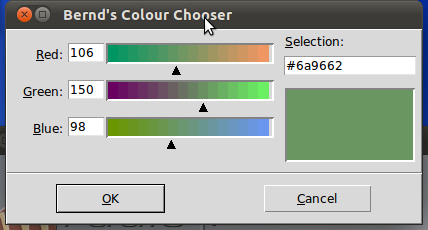
result = tkColorChooser.askColor ( color, option=value, ...)
If the user clicks the OK button on the pop-up window, respectively, the return value of askColor()
is a tuple with two elements, both a representation of the chosen colour, e.g.
((106, 150, 98), '#6a9662')
The first element return[0] is a tuple (R, G, B) with the RGB representation in decimal values (from 0 to 255).
The second element return[1] is a hexadecimal representation of the chosen colour.
If the user clicks "Cancel" the method returns the tuple (None, None).
The optional keyword parameters are:
| color |
The variable color is used to set the default colour to be displayed.
If color is not set, the initial colour will be grey.
|
| title |
The text assigned to the variable title will appear in the pop-up window's title area.
The default title is "Color". |
| parent |
Make the pop-up window appear over window W.
The default behaviour is that it appears over the root window. |
Let's have a look at an example:
from Tkinter import *
from tkColorChooser import askcolor

def callback():
    result = askcolor(color="#6A9662",
                      title = "Bernd's Colour Chooser")
    print result

root = Tk()
Button(root,
       text='Choose Color',
       fg="darkgreen",
       command=callback).pack(side=LEFT, padx=10)
Button(text='Quit',
       command=root.quit,
       fg="red").pack(side=LEFT, padx=10)
mainloop()
The look and feel depends on the operating system (e.g. Linux or Windows) and the chosen
GUI (GNOME, KDE and so on). The following windows appear, if you use Gnome:

Using the same script under Windows 7 gives us the following result:

Layout Managers / Geometry Manager
Introduction

In this chapter of our Python-Tkinter tutorial we will introduce the layout managers
or geometry managers, as they are sometimes called as well. Tkinter possess three layout
managers:
The three layout managers pack, grid, and place should never be mixed in the same master window!
Geometry managers serve various functions. They:
- arrange widgets on the screen
- register widgets with the underlying windowing system
- manage the display of widgets on the screen
Arranging widgets on the screen includes determining the size and position of components. Widgets can
provide size and alignment information to geometry managers, but the geometry managers has always the
final say on the positioning and sizing.
Pack
Pack is the easiest to use of the three geometry managers of Tk and Tkinter. Instead of having to declare precisely
where a widget should appear on the display screen, we can declare the positions of widgets with the pack command
relative to each other. The pack command takes care of the details. Though the pack command is easier to use, this
layout managers is limited in its possibilities compared to the grid and place mangers. For simple applications
it is definitely the manager of choice. For example simple applications like placing a number of widgets side by side,
or on top of each other.
Example:
from Tkinter import *

root = Tk()

Label(root, text="Red Sun", bg="red", fg="white").pack()
Label(root, text="Green Grass", bg="green", fg="black").pack()
Label(root, text="Blue Sky", bg="blue", fg="white").pack()

mainloop()

fill Option
In our example, we have packed three labels into the parent widget "root". We used pack() without any options.
So pack had to decide which way to arrange the labels. As you can see, it has chosen to place the label widgets
on top of each other and centre them. Furthermore, we can see that each label has been given the size of the text.
If you want to make the widgets as wide as the parent widget, you have to use the fill=X option:
from Tkinter import *

root = Tk()

w = Label(root, text="Red Sun", bg="red", fg="white")
w.pack(fill=X)
w = Label(root, text="Green Grass", bg="green", fg="black")
w.pack(fill=X)
w = Label(root, text="Blue Sky", bg="blue", fg="white")
w.pack(fill=X)

mainloop()

Padding
The pack() manager knows four padding options, i.e. internal and external padding and padding in x and y direction:
| padx |
External padding, horizontally

The code for the window above:
from Tkinter import *
root = Tk()
w = Label(root, text="Red Sun", bg="red", fg="white")
w.pack(fill=X,padx=10)
w = Label(root, text="Green Grass", bg="green", fg="black")
w.pack(fill=X,padx=10)
w = Label(root, text="Blue Sky", bg="blue", fg="white")
w.pack(fill=X,padx=10)
mainloop()
|
| pady |
External padding, vertically

The code for the window above:
from Tkinter import *
root = Tk()
w = Label(root, text="Red Sun", bg="red", fg="white")
w.pack(fill=X,pady=10)
w = Label(root, text="Green Grass", bg="green", fg="black")
w.pack(fill=X,pady=10)
w = Label(root, text="Blue Sky", bg="blue", fg="white")
w.pack(fill=X,pady=10)
mainloop()
|
| ipadx |
Internal padding, horizontally.
In the following example, we change only the label with the text "Green Grass", so that
the result can be easier recognized. We have also taken out the fill option.

from Tkinter import *
root = Tk()
w = Label(root, text="Red Sun", bg="red", fg="white")
w.pack()
w = Label(root, text="Green Grass", bg="green", fg="black")
w.pack(ipadx=10)
w = Label(root, text="Blue Sky", bg="blue", fg="white")
w.pack()
mainloop()
|
| ipady |
Internal padding, vertically
We will change the last label of our previous example to ipady=10.

from Tkinter import *
root = Tk()
w = Label(root, text="Red Sun", bg="red", fg="white")
w.pack()
w = Label(root, text="Green Grass", bg="green", fg="black")
w.pack(ipadx=10)
w = Label(root, text="Blue Sky", bg="blue", fg="white")
w.pack(ipady=10)
mainloop()
|
The default value in all cases is 0.
Placing widgets side by side
We want to place the three label side by side now and shorten the text slightly:

The corresponding code looks like this:
from Tkinter import *

root = Tk()

w = Label(root, text="red", bg="red", fg="white")
w.pack(padx=5, pady=10, side=LEFT)
w = Label(root, text="green", bg="green", fg="black")
w.pack(padx=5, pady=20, side=LEFT)
w = Label(root, text="blue", bg="blue", fg="white")
w.pack(padx=5, pady=20, side=LEFT)

mainloop()
If we change LEFT to RIGHT in the previous example, we get the colours in reverse order:

Place Geometry Manager
The Place geometry manager allows you explicitly set the position and size of a window, either in absolute
terms, or relative to another window. The place manager can be accessed through the place method. It can be
applied to all standard widgets.
We use the place geometry manager in the following example. We are playing around with colours in this example,
i.e. we assign to every label a different colour, which we randomly create using the randrange method of the
random module. We calculate the brightness (grey value) of each colour. If the brightness is less than 120, we
set the foreground colour (fg) of the label to White otherwise to black, so that the text can be easier read.
import Tkinter as tk
import random

root = tk.Tk()
# width x height + x_offset + y_offset:
root.geometry("170x200+30+30")

languages = ['Python','Perl','C++','Java','Tcl/Tk']
labels = range(5)
for i in range(5):
   ct = [random.randrange(256) for x in range(3)]
   brightness = int(round(0.299*ct[0] + 0.587*ct[1] + 0.114*ct[2]))
   ct_hex = "%02x%02x%02x" % tuple(ct)
   bg_colour = '#' + "".join(ct_hex)
   l = tk.Label(root,
                text=languages[i],
                fg='White' if brightness < 120 else 'Black',
                bg=bg_colour)
   l.place(x = 20, y = 30 + i*30, width=120, height=25)

root.mainloop()

Grid Manager
The first geometry manager of Tk had been pack. The algorithmic behaviour of pack is not easy to understand and
it can be difficult to change an existing design. Grid was introduced in 1996 as an alternative to pack. Though
grid is easier to learn and to use and produces nicer layouts, lots of developers keep using pack.
Grid is in many cases the best choice for general use. While pack is sometimes not sufficient for changing
details in the layout, place gives you complete control of positioning each element, but this makes it a lot
more complex than pack and grid.
The Grid geometry manager places the widgets in a 2-dimensional table, which consists of a number of rows and
columns. The position of a widget is defined by a row and a column number. Widgets with the same column number
and different row numbers will be above or below each other. Correspondingly, widgets with the same row number
but different column numbers will be on the same "line" and will be beside of each other, i.e. to the left
or the right.
Using the grid manager means that you create a widget, and use the grid method to tell the manager in which
row and column to place them. The size of the grid doesn't have to be defined, because the manager automatically
determines the best dimensions for the widgets used.
Example with grid
from Tkinter import *

colours = ['red','green','orange','white','yellow','blue']

r = 0
for c in colours:
    Label(text=c, relief=RIDGE,width=15).grid(row=r,column=0)
    Entry(bg=c, relief=SUNKEN,width=10).grid(row=r,column=1)
    r = r + 1

mainloop()

Mastermind / Bulls and Cows
Implementation in Python using Tkinter

In this chapter of our advanced Python topics we present an implementation of the game Bulls and Cows using Tkinter as the GUI. This game, which is also known as "Cows and Bulls" or "Pigs and Bulls", is an old code-breaking game played by two players. The game goes back to the 19th century and can be played with paper and pencil. Bulls and Cows -- also known as Cows and Bulls or Pigs and Bulls or Bulls and Cleots -- was the inspirational source of Mastermind, a game invented in 1970 by Mordecai Meirowitz. The game is played by two players. Mastermind and "Bulls and Cows" are very similar and the underlying idea is essentially the same, but Mastermind is sold in a box with a decoding board and pegs for the coding and the feedback pegs. Mastermind uses colours as the underlying code information, while Bulls and Cows uses digits.
The Algorithm is explained in detail in our chapter
"Mastermind / Bulls and Cows" in Advanced Topics. You can also find the code for the module combinatorics.
The Code for Mastermind
from tkinter import *
from tkinter.messagebox import *
import random

from combinatorics import all_colours

def inconsistent(p, guesses):
   """ the function checks, if a permutation p, i.e. a list of
colours like p = ['pink', 'yellow', 'green', 'red'] is consistent
with the previous colours. Each previous colour permuation guess[0]
compared (check()) with p has to return the same amount of blacks
(rightly positioned colours) and whites (right colour at wrong
position) as the corresponding evaluation (guess[1] in the
list guesses) """
   for guess in guesses:
      res = check(guess[0], p)
      (rightly_positioned, permutated) = guess[1]
      if res != [rightly_positioned, permutated]:
         return True # inconsistent
   return False # i.e. consistent

def answer_ok(a):
   """ checking of an evaulation given by the human player makes
sense. 3 blacks and 1 white make no sense for example. """
   (rightly_positioned, permutated) = a
   if (rightly_positioned + permutated > number_of_positions) \
       or (rightly_positioned + permutated < len(colours) - number_of_positions):
      return False
   if rightly_positioned == 3 and permutated == 1:
      return False
   return True

def get_evaluation():
   """ get evaluation from entry fields """
   rightly_positioned = int(entryWidget_both.get())
   permutated = int(entryWidget_only_colours.get())
   return (rightly_positioned, permutated)

def new_evaluation(current_colour_choices):
   """ This funtion gets an evaluation of the current guess, checks
the consistency of this evaluation, adds the guess together with
the evaluation to the list of guesses, shows the previous guesses
and creates a ne guess """
   rightly_positioned, permutated = get_evaluation()
   if rightly_positioned == number_of_positions:
      return(current_colour_choices, (rightly_positioned, permutated))

   if not answer_ok((rightly_positioned, permutated)):
      print("Input Error: Sorry, the input makes no sense")
      return(current_colour_choices, (-1, permutated))
   guesses.append((current_colour_choices, (rightly_positioned, permutated)))
   view_guesses()

   current_colour_choices = create_new_guess()
   show_current_guess(current_colour_choices)
   if not current_colour_choices:
      return(current_colour_choices, (-1, permutated))
   return(current_colour_choices, (rightly_positioned, permutated))


def check(p1, p2):
   """ check() calcualtes the number of bulls (blacks) and cows (whites)
of two permutations """
   blacks = 0
   whites = 0
   for i in range(len(p1)):
      if p1[i] == p2[i]:
          blacks += 1
      else:
         if p1[i] in p2:
             whites += 1
   return [blacks, whites]

def create_new_guess():
   """ a new guess is created, which is consistent to the
previous guesses """
   next_choice = next(permutation_iterator)
   while inconsistent(next_choice, guesses):
      try:
         next_choice = next(permutation_iterator)
      except StopIteration:
         print("Error: Your answers were inconsistent!")
         return ()
   return next_choice


def new_evaluation_tk():
   global current_colour_choices
   res = new_evaluation(current_colour_choices)
   current_colour_choices = res[0]

def show_current_guess(new_guess):
    row = 1
    Label(root, text="   New Guess:   ").grid(row=row,
                                       column=0,
                                       columnspan=4)
    row +=1
    col_count = 0
    for c in new_guess:
         print(c)
         l = Label(root, text="    ", bg=c)
         l.grid(row=row,column=col_count,  sticky=W, padx=2)
         col_count += 1

def view_guesses():
    row = 3
    Label(root, text="Old Guesses").grid(row=row,
                                         column=0,
                                         columnspan=4)
    Label(root, text="c&p").grid(row=row,
                                 padx=5,
                                 column=number_of_positions + 1)
    Label(root, text="p").grid(row=row,
                               padx=5,
                               column=number_of_positions + 2)
    # dummy label for distance:
    Label(root, text="         ").grid(row=row,
                                       column=number_of_positions + 3)


    row += 1
    # vertical dummy label for distance:
    Label(root, text="             ").grid(row=row,
                                       column=0,
				       columnspan=5)

    for guess in guesses:
      guessed_colours = guess[0]
      col_count = 0
      row += 1
      for c in guessed_colours:
         print(guessed_colours[col_count])
         l = Label(root, text="    ", bg=guessed_colours[col_count])
         l.grid(row=row,column=col_count,  sticky=W, padx=2)
         col_count += 1
      # evaluation:
      for i in (0,1):
        l = Label(root, text=str(guess[1][i]))
        l.grid(row=row,column=col_count + i + 1, padx=2)


if __name__ == "__main__":
   colours = ["red","green","blue","yellow","orange","pink"]
   guesses = []
   number_of_positions = 4

   permutation_iterator = all_colours(colours, number_of_positions)
   current_colour_choices = next(permutation_iterator)

   new_guess = (current_colour_choices, (0,0) )

   row_offset = 1
   root = Tk()
   root.title("Mastermind")
   root["padx"] = 30
   root["pady"] = 20

   entryLabel = Label(root)
   entryLabel["text"] = "Completely Correct:"
   entryLabel.grid(row=row_offset,
                sticky=E,
                padx=5,
                column=number_of_positions + 4)
   entryWidget_both = Entry(root)
   entryWidget_both["width"] = 5
   entryWidget_both.grid(row=row_offset, column=number_of_positions + 5)

   entryLabel = Label(root)
   entryLabel["text"] = "Wrong Position:"
   entryLabel.grid(row=row_offset+1,
                sticky=E,
                padx=5,
                column= number_of_positions + 4)
   entryWidget_only_colours = Entry(root)
   entryWidget_only_colours["width"] = 5
   entryWidget_only_colours.grid(row=row_offset+1, column=number_of_positions + 5)


   submit_button = Button(root, text="Submit", command=new_evaluation_tk)
   submit_button.grid(row=4,column=number_of_positions + 4)

   quit_button = Button(root, text="Quit", command=root.quit)
   quit_button.grid(row=4,column=number_of_positions + 5)
   show_current_guess(current_colour_choices)


   root.mainloop()
Menus
Introduction

Most people, if confronted with the word "menu", will immediately think of a menu in a restaurant.
Even though the menu of a restaurant and the menu of a computer program have at first glance
nothing in common, we can see that yet the have a lot in common. In a restaurant, a menu is a
presentation of all their food and beverage offerings, while in a computer application
it presents all the commands and functions of the application, which are available to the
user via the grafical user interface.
Menus in GUIs are presented with a combination of text and symbols to represent the choices.
Selecting with the mouse (or finger on touch screens) on one of the symbols or text, an action will be started.
Such an action or operation can for example be the opening or saving of a file, or the quitting or exiting
of an application.
A context menu is a menu in which the choices presented to the user are modified
according to the current context in which the user is located.
We introduce in this chapter of our Python Tkinter tutorial the pull-down menus of Tkinter, i.e. the lists at the
top of the windows, which appear (or pull down), if you click on an item like for example "File", "Edit" or "Help".
A Simple Menu Example
The following Python script creates a simple application window with menus.
from Tkinter import *
from tkFileDialog   import askopenfilename

def NewFile():
    print "New File!"
def OpenFile():
    name = askopenfilename()
    print name
def About():
    print "This is a simple example of a menu"

root = Tk()
menu = Menu(root)
root.config(menu=menu)
filemenu = Menu(menu)
menu.add_cascade(label="File", menu=filemenu)
filemenu.add_command(label="New", command=NewFile)
filemenu.add_command(label="Open...", command=OpenFile)
filemenu.add_separator()
filemenu.add_command(label="Exit", command=root.quit)

helpmenu = Menu(menu)
menu.add_cascade(label="Help", menu=helpmenu)
helpmenu.add_command(label="About...", command=About)

mainloop()
It looks like this, if started:

Introduction

A Tkinter application runs most of its time inside an event loop, which is entered via the mainloop method. It waiting for
events to happen. Events can be key presses or mouse operations by the user.
Tkinter provides a mechanism to let the programmer deal with events. For each widget, it's possible to bind Python
functions and methods to an event.
widget.bind(event, handler)
If the defined event occurs in the widget, the "handler" function is called with an event object.
describing the event.
#!/usr/bin/python3
# write tkinter as Tkinter to be Python 2.x compatible
from tkinter import *
def hello(event):
    print("Single Click, Button-l")
def quit(event):
    print("Double Click, so let's stop")
    import sys; sys.exit()

widget = Button(None, text='Mouse Clicks')
widget.pack()
widget.bind('<Button-1>', hello)
widget.bind('<Double-1>', quit)
widget.mainloop()
Let's have another simple example, which shows how to use the motion event, i.e. if the mouse is
moved inside of a widget:
from tkinter import *

def motion(event):
  print("Mouse position: (%s %s)" % (event.x, event.y))
  return

master = Tk()
whatever_you_do = "Whatever you do will be insignificant, but it is very important that you do
it.\n(Mahatma Gandhi)"
msg = Message(master, text = whatever_you_do)
msg.config(bg='lightgreen', font=('times', 24, 'italic'))
msg.bind('<Motion>',motion)
msg.pack()
mainloop()
Every time we move the mouse in the Message widget, the position of the mouse pointer will
be printed. When we leave this widget, the function motion() is not called anymore.
Events
Tkinter uses so-called event sequences for allowing the user to define which events, both
specific and general, he or she wants to bind to handlers.
It is the first argument "event" of the bind method. The event sequence is given as a string,
using the following syntax:
<modifier-type-detail>
The type field is the essential part of an event specifier, whereas the "modifier" and
"detail" fields are not obligatory and are left out in many cases. They are used to
provide additional information for the chosen "type". The event "type"
describes the kind of event to be bound, e.g. actions like mouse clicks, key presses or
the widget got the input focus.
| Event |
Description |
| <Button>
|
A mouse button is pressed with the mouse pointer over the widget.
The detail part specifies which button, e.g.
The left mouse button is defined by the event <Button-1>, the middle button
by <Button-2>, and the rightmost mouse button by <Button-3>.
<Button-4> defines the scroll up event on mice with wheel support and
and <Button-5> the scroll down.
If you press down a mouse button over a widget and keep it pressed, Tkinter will
automatically "grab" the mouse pointer. Further mouse events like Motion and Release events will be sent to the current widget, even if the mouse is moved outside the current widget. The current position, relative to the widget, of the mouse pointer is provided in the x and y members of the event object passed to the callback. You can use ButtonPress instead of Button, or even leave it out completely: , , and <1> are all synonyms.
|
| <Motion>
|
The mouse is moved with a mouse button being held down.
To specify the left, middle or right mouse button use
<B1-Motion>, <B2-Motion> and <B3-Motion> respectively.
The current position of the mouse pointer is provided in the x and y members
of the event object passed to the callback, i.e. event.x, event.y
|
| <ButtonRelease>
|
Event, if a button is released. To specify the left, middle
or right mouse button use
<ButtonRelease-1>, <ButtonRelease-2>, and <ButtonRelease-3>
respectively. The current position of the mouse pointer is provided in the
x and y members of the event object passed to the callback, i.e. event.x, event.y
|
| <Double-Button>
|
Similar to the Button event, see above, but the button is
double clicked instead of a single click.
To specify the left, middle or right mouse button use <Double-Button-1>,
<Double-Button-2>, and
<Double-Button-3> respectively.
You can use Double or Triple as prefixes. Note that if you bind to both a single
click (<Button-1>) and a double click (<Double-Button-1>), both
bindings will be called.
|
| <Enter>
|
The mouse pointer entered the widget.
Attention: This
doesn't mean that the user pressed the Enter key!.
<Return> is used for this purpose.
|
| <Leave>
|
The mouse pointer left the widget.
|
| <FocusIn>
|
Keyboard focus was moved to this widget, or to a
child of this widget.
|
| <FocusOut>
|
Keyboard focus was moved from this widget to
another widget.
|
| <Return>
|
The user pressed the Enter key. You can bind to virtually
all keys on the keyboard: The special keys are Cancel (the Break key),
BackSpace, Tab, Return(the Enter key), Shift_L (any Shift key), Control_L
(any Control key), Alt_L (any Alt key), Pause, Caps_Lock, Escape, Prior
(Page Up), Next (Page Down), End, Home, Left, Up, Right, Down, Print,
Insert, Delete, F1, F2, F3, F4, F5, F6, F7, F8, F9, F10, F11, F12,
Num_Lock, and Scroll_Lock.
|
| <Key>
|
The user pressed any key. The key is provided in the
char member of the event object passed to the callback (this is an empty string
for special keys).
|
| a
|
The user typed an "a" key. Most printable characters can be
used as is. The exceptions are space (<space>) and less than (<less>).
Note that 1 is a keyboard binding, while <1> is a button binding.
|
| <Shift-Up>
|
The user pressed the Up arrow, while holding the Shift key
pressed. You can use prefixes like Alt, Shift, and Control.
|
| <Configure>
|
The size of the widget changed. The new size is provided
in the width and height attributes of the event object passed to the callback.
On some platforms, it can mean that the location changed.
|